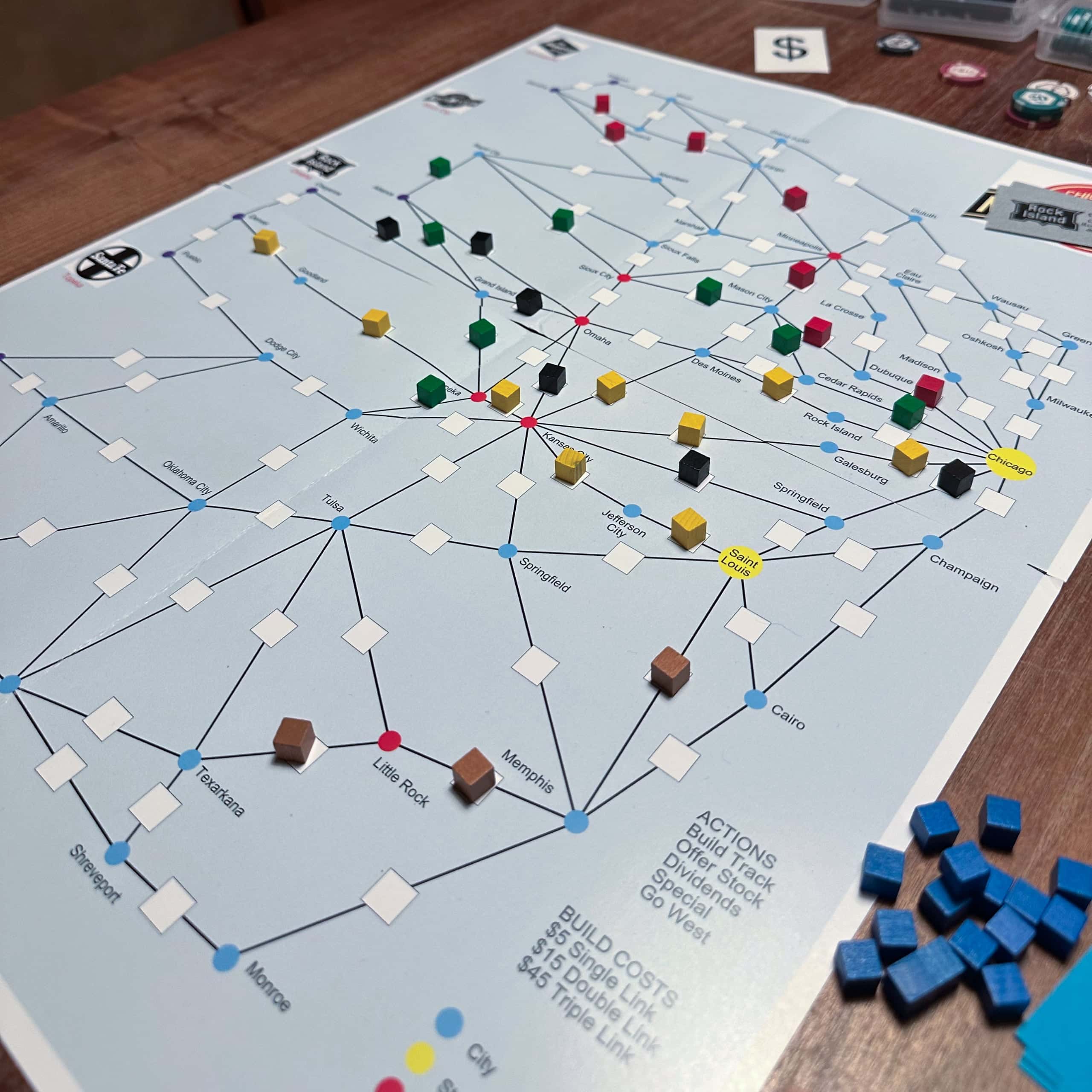
I wanted to do a redraw of the Chicago & NorthWestern board. I own the original Winsome Games edition. The Rio Grande version has a nicer board, though it’s a bit plain and doesn’t include the most obvious usability fix I wanted to include in my version.
Let’s start with the original version. It’s usable, doesn’t get in the way of playing the game, but it’s not pretty.
Since the important part of the board is a graph, I started by creating the board in Gephi (a graph editor). I was ready to ditch the geographical accuracy (the geography isn’t really a strong part of the original board) and even though about doing a board where Chicago would be right in the middle!
Laying out the graph nicely by hand would’ve been a lot of unpleasant work, so I used the automatic tools available in Gephi. A method called “Fruchterman Rheingold” created a vaguely circular shape of the graph, so that’s what I used. It needed some manual work, as some of the edges crossed each other and you can’t have that. I added some colours to the nodes and ended up with this:
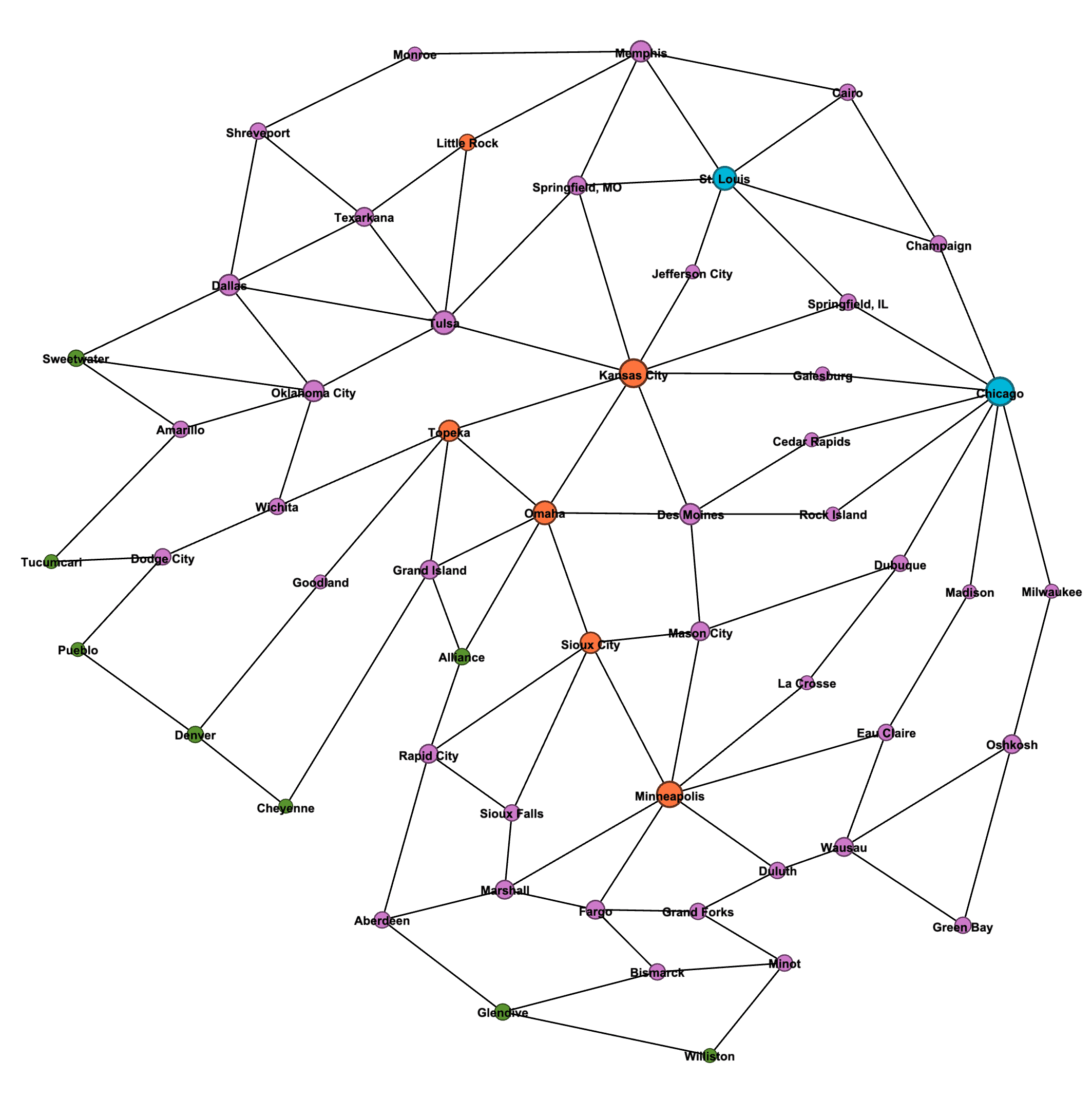
This is pretty good! The east-west direction is correct here, but the north-south direction is mirrored – that’s just how the layout method organized this. While geographical accuracy wasn’t a goal, I flipped the image vertically when I moved this to Pixelmator for editing.
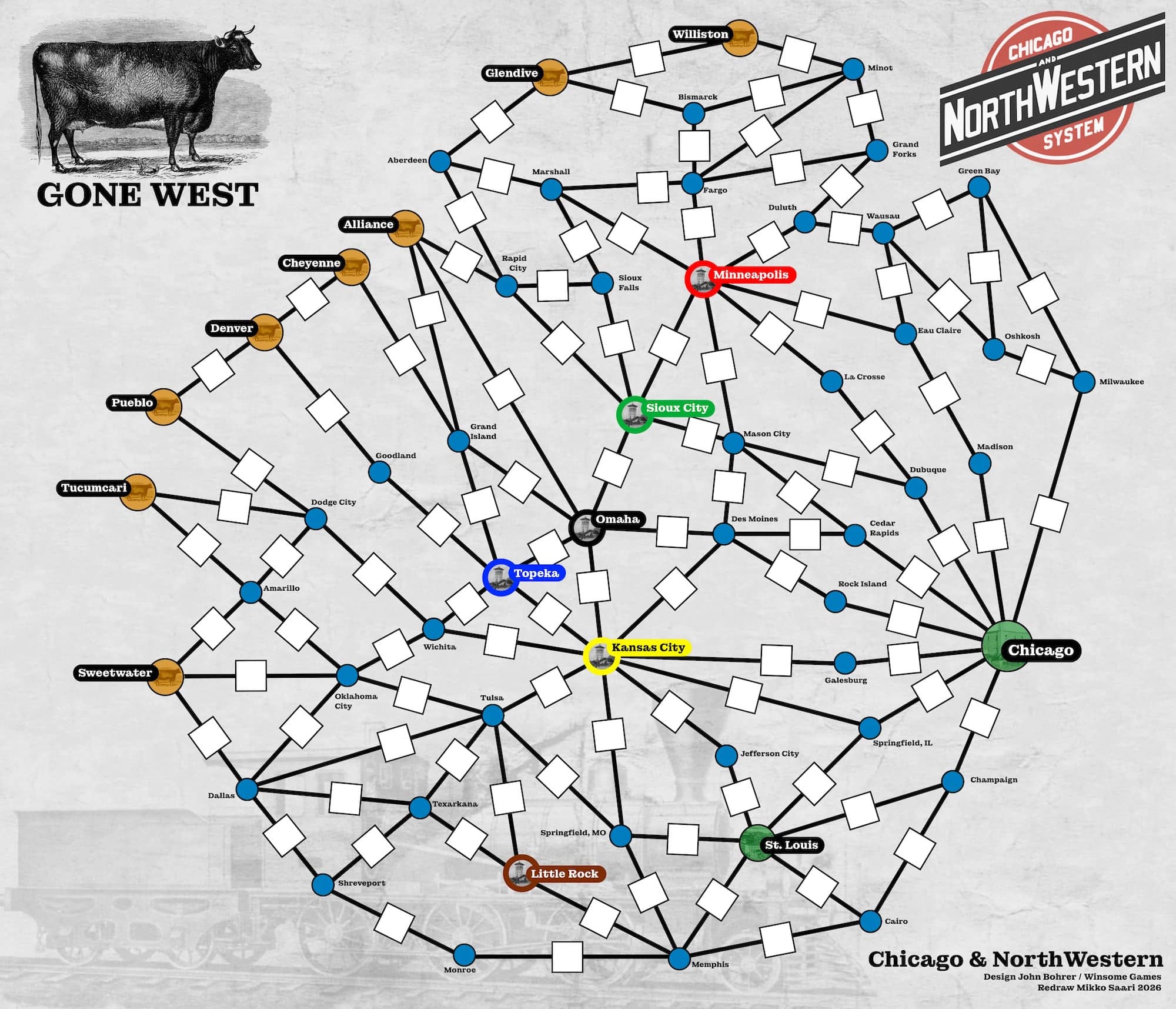
I was going for a minimalist look. The main usability improvement I mentioned was to colour the railroad destination cities so that it’s immediately obvious where each company is headed to. I think it’s weird the Rio Grande edition didn’t fix that, as the problem is obvious the minute you play this game with someone new. “Where Milwaukee Road is going, again?”
The cities got smaller or larger circles, with colour coding to tie the different types together. The tracks are just plain black lines with centimeter squares in them to facilitate the 8mm cubes used in the game. The original map has all the squares lined the same way; I had the cubes aligned with the line (I simply rotated the square the same amount the line was rotated).
Creating the tracks was easy, just time-consuming. Copy a line-and-square combo, move the line ends to the centers of the cities, move the square near the center of the line and rotate. Then repeat that almost hundred times!
The background has a light grey “old paper” effect, and as a finishing touch I added a transparent photo of an old locomotive there. One corner got the Chicago & NorthWestern railroad logo and one has a nice old image of a cow – the Gone West companies can be marked there. The same cow appears in the western city circles, by the way. (The destination cities have a small picture of a depot, and St. Louis and Chicago have photos of places in those cities.)
I thought about adding railroad company logos on the board to mark the spots for company cubes and money. I decided that would look ugly, and instead opted for charter cards. These are poker card sized cards with bright company logos (which would’ve looked awful on the board) and spots for cubes and money. The cards can also be flipped to show the “Gone West” status. Too bad I can’t create three-sided cards for “Special available” / “Special used” / “Gone West”.
The board also doesn’t have an action reference. I put that on cards, too. The action reference cards list all the actions and show if the dividend action is available. When a player takes the dividend action, they can flip the card to show that, and the action is no longer listed in the action reference.
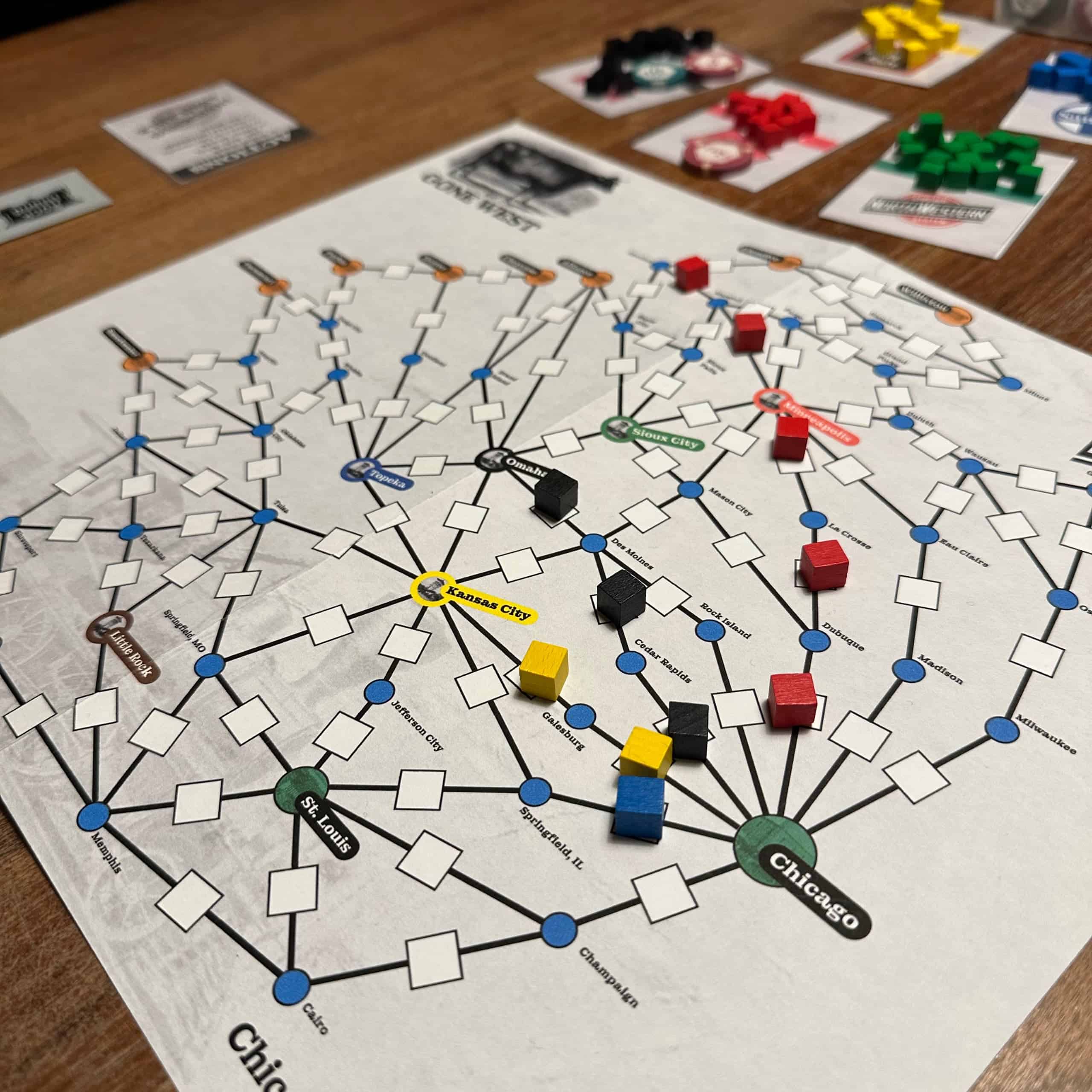
Here’s my final version.
The one thing that annoys me is the destination city labels and the way they point to different directions. That was the easy solution, to avoid them overlapping with the tracks. It would look nicer if they all pointed the same way, but that would require reorganizing the tracks a bit.
This map is a lot more compact than the original. The original is almost A2 size. This fits on single A3. It’s not too cramped; it could be larger, but I like the compactness. Reading the routes is easy. The action reference cards turned out pretty good, too.
I noticed an interesting side effect. You see how the red line has built from Chicago via Dubuque and La Crosse to Minneapolis. That happened both times I’ve played with this new map. Why not – it’s the straight line to Minneapolis, the destination for red. However, this makes the green line less attractive, as Dubuque – Mason City – Sioux City would be the most direct line for green, while for red, reaching Minneapolis through Madison and Eau Claire would be the same distance, even though it looks longer. As a result, the green line didn’t start at all in either of those games.
…And now that I look at this more closely, I spotted an error in my map. There should be a connection between Cedar Rapids and Mason City that is missing. That would give green an alternate three-link route to Sioux City. Oops! Looks like I was missing a couple of other connections as well, but those weren’t as critical. The image above is updated to reflect the correct map.